Ink is a medium of decisions. A mark goes down or it doesn't, and once the nib has crossed the paper there is no lifting it back out. That sounds unforgiving until you find a subject that agrees to be simplified — and few subjects agree more readily than a lighthouse.
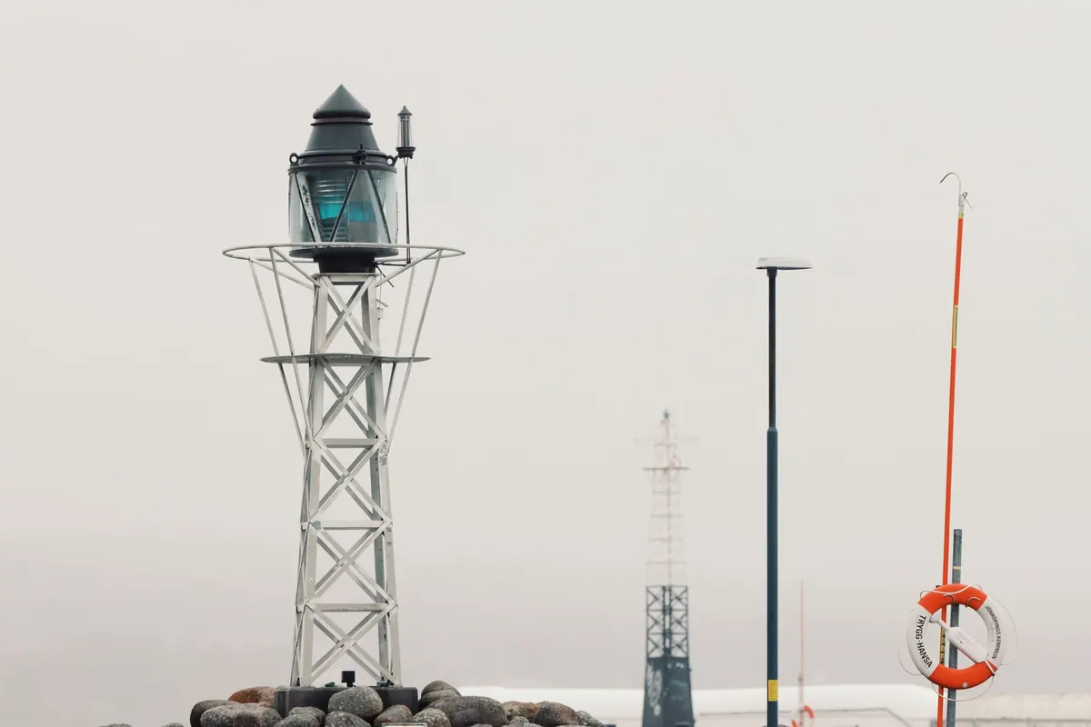
Picture a tower at the end of a breakwater in flat afternoon light. What you actually see is a dark vertical shape, a bright lantern, a band of sea, a scatter of rocks. Not much grey. The building is already halfway to being a drawing before you have uncapped anything.
A Subject Already Reduced to Essentials
Most landscape subjects fight you. Foliage is a cloud of midtones, water is a shifting mirror, a hillside full of houses is a hundred small decisions. A lighthouse offers a handful of large, legible shapes stacked in a clear order: base, shaft, gallery, lantern, roof. Each one has a job, and each one separates cleanly from its neighbours.
Ink has no grey of its own. Every value between paper white and solid black has to be built from marks — hatching, stippling, cross-hatching, the width of a brush pen. That is slow work on a fuzzy subject. On a lighthouse it is fast, because the value structure is already dramatic. Whitewash against dark rock. Shadowed curve against lit curve. Glowing glass against a heavy sky.
The pen rewards you for choosing. The lighthouse rewards you for looking. Put the two together and the drawing almost drafts itself.
Contrast: Find the Darkest Dark First
Before you draw a single line, squint at the scene until the detail falls away. You are looking for the anchor — the one passage that will be solid black. It might be the shadow side of the tower, the rocks at the base, the band of sea directly beneath the horizon, or the underside of the gallery. Choose one. Commit to it early.
New ink sketchers tend to start with outlines and then hunt for shading, which produces a drawing that is all edges and no weight. Reverse the habit. Block in the darkest shape first, however roughly, and the rest of the drawing has something to measure itself against.
The three-value test
Try this on scrap paper: reduce the whole scene to three values — white, mid, black. Paper stays white. Hatching makes the mid. Only the anchor becomes black. If the sketch reads clearly at that stage, the finished drawing will hold up. If it doesn't read, no amount of fiddly detail will rescue it.
Two contrast traps are worth knowing. The first is the lantern glass, which beginners tend to fill in. Resist. Leave the glass mostly bare and let a few dark mullions describe it; a bright, almost empty lantern against a dark sky does more than any amount of shading inside it. The second is the sea. Water is rarely as dark as it looks. Keep it light and let the rocks carry the weight.
Silhouette: Does It Read at a Glance?
Every lighthouse has a fingerprint. The taper of the shaft, the overhang of the gallery, the corbels beneath it, the shape of the roof, the stubby keeper's cottage attached at the base — these are what let you recognise a specific tower from a mile away. Your drawing should be recognisable the same way.
Draw a thumbnail no bigger than your thumb, filled in solid black, and look at it. If the shape could be any lighthouse anywhere, you have drawn a generic tower rather than the one in front of you. Go back and push the proportions: fatter, taller, a shallower taper, a wider gallery, a flatter roof.
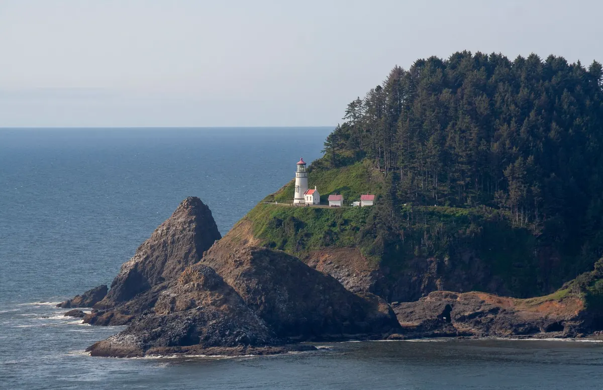
Silhouette also decides your composition. A tower standing against open sky is a clean cut-out and can hold the centre of the page. A tower backed by a headland gets lost unless you separate it with a lighter sky, a rim of white paper along its lit edge, or a deliberate gap of unpainted space. Placing the horizon low makes the tower monumental; placing it high makes the tower intimate and the sky enormous. Neither is wrong. Just decide, rather than letting it happen.
Repetition: Rhythm You Can Lean On
This is the quiet pleasure of the subject. Lighthouses are full of repeating elements, and repetition gives a drawing rhythm, structure, and a sense of scale without any extra invention on your part. Look for:
- Balusters in the gallery railing, tightening in spacing as the rail curves away from you
- Mullions in the lantern, dividing the glass into regular bays
- Windows climbing the shaft in a spiral, each one smaller than the last
- Course lines in the stonework, or panel edges on a cast-iron tower
- Rock strata at the base, angling up or down but staying parallel
- Wave lines, roughly horizontal, breaking into sharper strokes near the rocks
- Fence posts, bollards, or the steps of the path leading in
Two rules keep repetition from going mechanical. First, spacing changes with perspective — halve the gap each time the rail turns further away. Second, line weight thins as elements recede. A near baluster gets a firm, dark stroke; one on the far side of the gallery gets a lighter, shorter one. That single habit creates depth more convincingly than any amount of careful shading.
Choosing the Marks and the Order of Work
A fine nib around 0.1 or 0.3 mm, a medium nib around 0.5 mm, and a brush pen will cover almost any lighthouse you meet. The fine nib handles railings, mullions, and hatching. The medium nib gives you the structural lines of the tower. The brush pen does rocks and the darkest masses, and it forgives a slightly loose approach.
A workable sequence for a twenty-minute study:
- Lightly place the big shapes with a pencil — tower, horizon, main rock mass. Keep this almost invisible, or skip it entirely if you are feeling brave.
- Draw the structure of the tower with the medium nib: the two outer edges, the gallery line, the roof. Check the taper twice before you commit.
- Block in the anchor dark with the brush pen or dense hatching. Blunt, unapologetic, no detail yet.
- Add the repeating elements — railing, windows, mullions — using lighter lines as they recede.
- Hatch the shadow side of the shaft, following the curve of the building rather than the flat of the page.
- Finish with rock texture and a few deliberate wave marks near the base, then stop.
That last instruction is the hard one. Ink drawings of lighthouses usually fail from too many marks, not too few. Once the silhouette reads and the contrast is doing its job, additional lines mostly add noise.
Sketch It Small, Sketch It Often
The fastest way to improve is to stop treating each lighthouse as a finished picture and start treating it as a study. Work small — four or five thumbnails on a single page — and give yourself a strict time limit. Ten minutes forces you to find the silhouette and the anchor dark, which are the two things that matter most. Detail can wait until you have both.
A useful exercise: draw the same tower five ways on one spread. One in pure silhouette. One with the horizon high. One with the horizon low. One at night, lantern blazing and the tower a dark mass. One in blazing sun with the shadow side hatched hard. You will learn more from that page than from a month of careful single drawings.
Keep a small notebook just for tower shapes and railing patterns, filled in at odd moments. Over a few months it becomes a reference you trust, because every page in it came from your own hand and your own looking. Then take the pen out to a real headland on a windy afternoon, find the darkest shape, and let the lighthouse do the rest of the work.
Photo: cocoparisienne / Pixabay