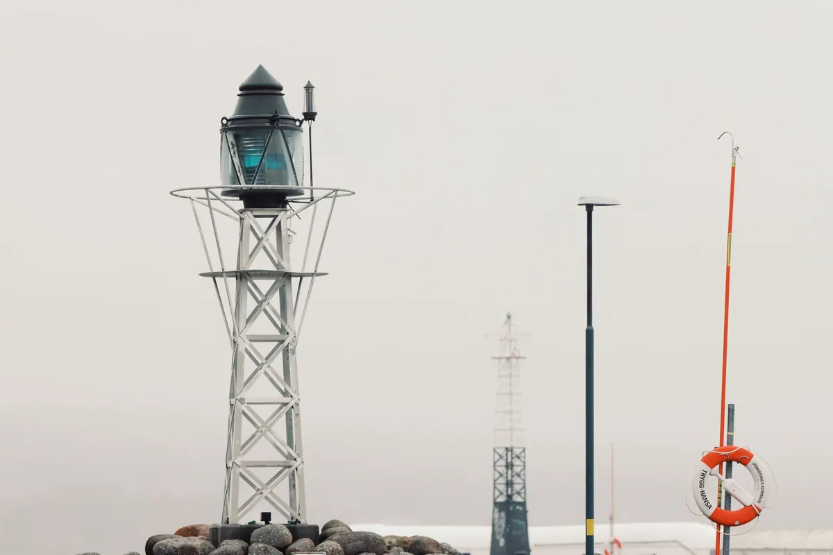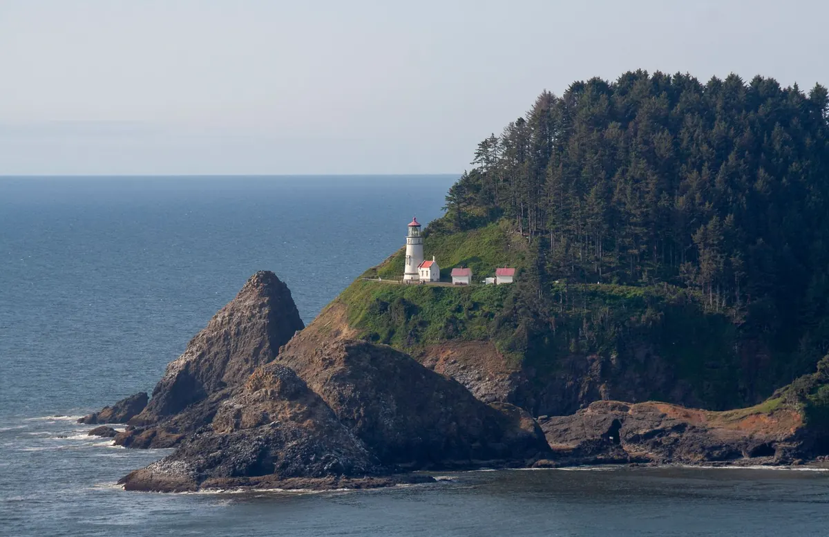
Fog is not the absence of a picture. It is a picture with the contrast turned down, and a lighthouse is usually the one thing that survives the edit. Painted badly, you get grey soup with a tower floating in it. Painted well, the fog becomes the subject: the way the beam gives up after eighty metres, the way the gallery rail goes soft before the door does, the way the horizon simply stops existing.
The method below holds up whether you work in watercolour, oils, acrylics or gouache. It comes down to three things — value control, edge softness and the order in which you lay your washes — and none of them require special materials.
Name Your Fog Before You Paint It
Fog has its own light. It is rarely neutral grey, and it is almost never the same tone across the whole picture. On a coastal morning it might be a warm pearl with a hint of yellow ochre near the sun and a cooler, bluer density to the left. In the evening it turns lilac. Decide on that colour before you mix anything else, and mix a generous puddle of it. That single tone is going to appear in the sky, in the sea, in the distant headland and, in a weakened form, inside the lighthouse itself.
Two rules govern atmospheric perspective, and they are worth writing on the easel. First, contrast decreases with distance. Second, colour drifts toward the colour of the air between you and the object. Fog is dense air, so both effects arrive fast. A dark granite cliff two hundred metres out may sit only two or three values away from the fog behind it.
Build a Tonal Ladder Before You Touch Colour
Squint at your subject and count the values. In fog you will usually find five, and no more:
- The fog tone itself, which fills most of the middle of the picture.
- A slightly darker fog, for the band of air just above the water or behind the headland.
- A pale glow, near white but tinted, where the light source sits.
- A midtone for the lighthouse and any middle-distance rock.
- One genuine dark, reserved for whatever is closest to you — a wet boulder, a strip of foreground shingle, the near edge of the pier.
Note what is missing: a true black, and a true white. If you place either on the canvas early, the fog collapses. The single dark is your anchor; spend it late and spend it in one place.
Compress the Tower's Value
A common mistake is to paint the lighthouse at the value it would have on a clear day and then soften its edges, hoping fog will appear. It will not. If the tower sits in the middle distance, lift its value two steps toward the fog tone. Yes, the red band will look washed out on the palette. That is the point. The eye reads distance from how little the object differs from the air around it, not from how blurry you made the outline.
Soft Edges, and the Three Places to Keep Them Hard
Most edges in a fog painting should be lost. Not vague — lost. There is a difference. A lost edge is one you can still find if you look for it, where two shapes meet and one quietly gives way. A vague edge is what happens when you drag a dry brush back and forth and hope.
Keep your hard edges for three things: the nearest object in the foreground, the lamp glass itself, and the silhouette of the tower where it turns against the brightest part of the fog. Everything beyond that goes soft. A useful working order is to paint the far shapes wet into wet, let them settle, then come back with sharper marks only in the foreground.
Save your hardest edge and your darkest dark for the closest thing in the picture.
Layered Washes, Step by Step
The sequence matters more than the medium. In watercolour each veil must dry before the next; in oils and acrylics you can scumble pale opaque paint over a darker passage to push it back. Either way, work from the far distance forward and from light to dark.
- Lay the sky and sea as one field of the fog tone, slightly darker at the top of the sky and slightly warmer near the water. Leave the horizon unmarked. There is no line in fog.
- Drop in the farthest shapes — headland, distant rocks, a suggestion of another tower — while the ground is still damp. One touch each. Do not go back.
- Establish the lighthouse as a midtone in a single flat shape, no windows, no stripes. Check it against the fog with a squint.
- Add the second veil: a thin, even wash of the fog tone across everything behind your foreground. This is the step painters skip, and it is the one that creates depth.
- Bring in the near darks — foreground rock, wet shingle, a mooring post. Now the picture has a front, a middle and a back.
- Place the light. The lamp is the brightest note, but keep it small and slightly warm. Fog scatters light, so a halo of pale wash around the lamp does more than a bright dab on the glass.
- Sharpen only the foreground and the tower's leading edge, then stop. Every additional mark costs you distance.
What Turns Fog Into Grey Soup
If the painting is not working, the cause is usually one of these:
- Pure white for fog. White reads as paper, not air. Tint it.
- Uniform softness. If nothing is sharp, the eye has nothing to compare against and the whole image flattens.
- Too many values. Fog has fewer tones than clear weather, not more.
- Details at distance. Windows, railing posts and gallery bars disappear long before the tower does.
- Veiling a finished painting. A wash laid over dry, detailed work looks like a dirty window. Build the fog in layers from the start.
- Identical sky and sea. They should meet in the fog tone, but the water needs a hint of horizontal movement — a few darker strokes low and near, fading fast.
A Five-Minute Check Before You Commit
Make a thumbnail first, three values only: fog, tower, near dark. If the tower does not read at a glance in that thumbnail, no amount of edge work will save the larger painting. Once the real piece is underway, prop it against the far wall and look at it from across the room. Fog should be the first thing you notice and the lighthouse the second. Then squint: the tower should hold its shape while everything beyond it merges.
Keep one clean rag and a small pot of the fog tone beside you for touch-ups; a single dragged stroke through a too-crisp distant edge can restore the whole sense of distance. And resist finishing. Fog paintings are strongest when they look like the weather is still deciding what to do.